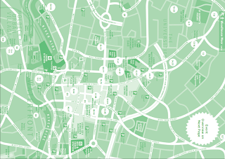
I found this map from Light Night brochure last month and kept it as a reference. Aim of this map is to show where the events were taking place in Leeds city centre. This map was intended as a tour guide for those unfamiliar with the parking system, transportation or the locations of buildings such as museum and shopping malls.
This map show a variety of things with only two main colours: car parks, street name, main buildings (shopping malls, town hall, central library, museum), transportation (bus station, train station, interchange). Because most visitors come to Leeds city centre to attend these events, so having white colour to show the event places and main streets could be a good way to capture viewer’s attention and quickly connect the map to the event information on the next page. Dark green to highlight the importance (transportation and museum), this would be the first information for new visitors on arrival. However, one thing I don’t like about is the information printed on the next page. The map and the event’s information should be on the same page so that reader could easily and quickly refer to. Another matter is that it is hard to find the event places on the map (its hard to refer from the events info), so I would suggest that the event place should be colourcoded. As a result reader could quicker to identify the colour highlighted. What makes reader easier to identify each building is the simplicity of this 2D map. It shows the relative size and shapes of the main buildings without extra distracting details.

No comments:
Post a Comment